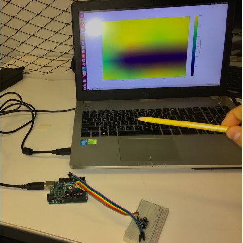
This week I was able to process and visualize the data received from the Arduino using a Python script. The code mainly uses the matplotlib and numpy libraries’ functions in order to manipulate and plot the data in different formats. The data were captured by the VL35L1X sensor on an Arduino Uno for sixteen different fields of views. Each field of view contains a 4x4 matrix of SPADs (Single photon avalanche diode) and measures the distance values of the center of each section. The resultant output from the measurements is an array of sixteen values each indicating the distance measured for each field of view.
The Arduino publishes the data through the serial communication port. The data received on the computer can be translated into a 4×4 matrix using the numpy’s reshape function. Therefore, the live data values of the matrix can be plotted in a 2D contour format as shown below.
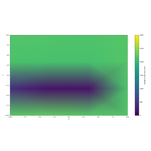
That is the contour map of a pencil holding in front of the sensor which the values of the distances of the pencil are translated into color intensities in the form of a “heat map”.